31 January 2008

"You've Gotta Have a Gimmick"


Luxurious Water?!


Even bottled water can be Most Excellent. Well, perhaps, very well packaged and as is my passion - very well designed! Stylish and sexy, here are the two latest frontrunners, "SEI" water and "Bling" water.


SEI

Sei water is the new most fashionable water on the block. In award-winning packaging that resembles a flask, one side is rounded and fits in your hand so it can be carried snugly. The other side features a raised logo with the company’s name wrapping around the bottle. Its flatness enables the small size to fit easily into a pocket or purse; the  large bottle can fit into a briefcase or sports bag.  The PET, (Plastic used for water bottles), bottle is available in 275 ml, 500 ml and 1 liter bottles and can be found at retail for $2.00 to $5.00. The bottle won the gold award in the beverage category in 2005 from the National Association of Container Distributors (NACD). According to the judges, the simplicity of the package, with no label, shows off the water; the cap has no added colorants to distract from the product; the flask shape is unique; and the smallest size has a slight curve for comfort in a pocket. Two years of development were required to create the containers. It’s not just an award-winning bottle: the taste of the natural spring water is sweet, pure and crisp. The water is drawn from the Catskill Mountains in New York, an old source rich in history .


Bling
Slightly over the top... here is "Bling" water. The Limited-Edition bottle, (shown above), is a corked 750 ml, reusable frosted glass bottle, exquisitely handcrafted with Swarovski Crystals.


Bling H2O is the inspiration of Kevin G. Boyd, Hollywood writer-producer. While working on various studio lots where image is of the utmost importance he noticed that you could tell a lot about a person by the bottled water they carried.

In Hollywood it seemed as if people flaunted their bottled water like it was part of their presentation. Whether the bottles had a cool shape or came from an exotic island, none truly made that defining statement. Bling H2O was fashioned to make that defining statement. The mission was to offer a product with an exquisite face to match exquisite taste. The product is strategically positioned to target the expanding super-luxury consumer market. Initially introduced to hand-selected athletes and actors, Bling H2O is now excitedly expanding it’s availability. Bling H2O has been featured at many recent celebrity events including the MTV Video Music Awards and television’s biggest event, The Emmys. 

Bling H2O is pop-culture in a bottle. But it's not for everyone, just those that Bling.


29 January 2008

"Made With Love and Blood."


Ray Caesar

Special thanks to my friend Jonathan for introducing me to the work of artist Ray Caesar. I instantly fell in love with Ray's fantastic, surreal and perhaps a bit disturbing art. I inquired as to the possibility of purchasing one of Ray's Most Excellent creations, but was told that almost all were already sold and new work may not be available until sometime this year. The method that Ray uses to create these marvelous images is described below. This information is taken directly from his website. I encourage anyone interested in surreal art to explore the site: http://www.raycaesar.com

(The name of each piece appears below)


Ebb Tide ;-)


"My work is entirely digital, from its creation to its method of printing. I create models in a three dimensional modeling software and cover these models with painted and manipulated photographic textures that wrap around them like a map on a globe. Each model is then set up with a invisible skeleton that allows me to pose and position the figure in its three dimensional environment. Digital lights and cameras are added with shadows and reflections simulating that of a real world.

First the models are sculpted similar to pushing and pulling the surface of a piece of clay. I am often reminded of being in preschool with my huge chunk of plasticene. I once modeled a plasticene shoe but my father forbade me to wear it in public. I then create an inner structure of joints similar to a skeleton that allows me to pose the figure with a spine, shoulders, elbows and even finger joints. Many heads are modeled with many a different expression and these can be blended to create a subtle look similar to the one my wife has when I have done something suspicious.

I color the models first in a very simple way, then each surface in the model is wrapped with a texture that may be painted digitally such as a flower petal or from a digital photograph such as a wood surface. I collect textures the way some people collect little silver spoons and I have a story about each texture in my collection such as the one about my father's hip operation scar or the picture I convinced my gastroenterologist to give me of the inside of my colon. My favorite textures to collect are skin textures, as I have a legitimate excuse to ask people to expose large areas of bare skin.

Lights are introduced with casting shadows and cameras with all the properties of real world cameras can be set up and positioned. Atmosphere and fog fill the environment. Grass is grown, leaves sprout from the limbs of trees.

As my work is printed I am often asked about my original, but it exists only in the computer in a dimensional world of depth, width and height. I am fascinated by the concept that this 3 dimensional space exists much as another reality and even though I turn the computer off, I am haunted by the fact that this space is still there existing in a mathematical probability, and the space that we live in now might not be all that different."

- Ray Caesar


Power and Glory


Hally Lou


Madre


Consort


Sanctuary


Pollux


Blessed, (detail at title of blog entry - above)

28 January 2008

Bling. Bling.


The Light Shade Shade


Designed by Jurgen Bey in 2004 for MOOOI, the "Light Shade Shade" is a one way mirror that reflects its environment as well as concealing the chandelier within. When the light is turned on, the Light Shade Shade reveals its unforeseen identity and projects the former beauty that lies within. The Light Shade Shade is part of the Moooi "weer" collection and may also be sold without the inner shade in order to breathe life back to an aging chandelier. It is a very exciting way to give the traditional a very contemporary and modern "twist" - a look I am very fond of. The shade is made of a semi-transparant mirror film surrounding a crystal chandelier lamp. There are 18 arms on the chandelier shown below.  http://www.moooi.com


Immediately following the Most Excellent chandelier pictured below are several room/environment photos revealing the chandelier installation.


The Light Shade Shade


Hollywood Wall


Following very much the same idea as the Light Shade Shade, these "Hollywood Wall" sconces by Viso Collection, were designed in 2007. When lit, the one-way mirror reveals the crystal beaded strands which instantly add a splash of glamour and "Bling Bling".


25 January 2008

Stylized Flames.


Dramatic, daring, stylish and very contemporary are the Glass Fireplaces by Bloch-Design. This is obviously not an ordinary fireplace. The flames, which are given center stage, are safely contained within a glass fireplace enclosure. Perfect in a modern home, the simplicity of this fireplace is just stunning. While I think this fireplace is a Most Excellent Thing, my friend Matt in New York pointed out that the heat and soot created by the fire may create some difficulties. It's worth investigating.
http://www.bloch-design.com


24 January 2008

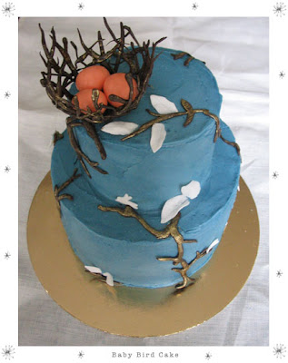
Let Us Eat Cake.


These cakes, and golden-covered Twinkies are by Sarah Magid.
They are absolutely stunning, definitely Most Excellent and worthy of a spot on this blog!
All are works of art that I would find very difficult to eat.


23 January 2008

"The Washington Post" - AT HOME


"The Grandest Room in the House"


It truly is. I believe that when I am designing a home, special attention should be paid to the interior design of the powder room... Why? ... Well, the powder room, as I see it, is a small "retreat" from the other rooms in the house. It should be a "gem" and have distinct elements and characteristics that set this space apart. However, I am not suggesting a powder room with minimalist Italian furnishings and fittings should be placed in a home full of period pieces and furnishings. What I am suggesting is that, within the same genre of a home, the powder room may carry whimsical elements, rich detailing, unique touches and accompaniments. 


The powder room, I designed, (pictured below), was published in the Fall 2007 issue of The Washington Post's, AT HOME magazine. (AT HOME is a high-end residential interior design magazine.) The space sports a strong black and white Chinoiserie wallpaper from the Ralph Lauren Home Collection, and a custom Roman shade composed of silk and linen with a bold ebony Grosgrain ribbon border. A black lacquer "bamboo" mirror gives a nod to the Asian-inspired design of the room. The sconce, just above the mirror, from Waterworks, supports the more traditional presence of this room and the design of the house just beyond the door. (Please click on the photo of the magazine cover, (above), and the article, (below) to enlarge.)


22 January 2008


One Year Ago...

I cannot believe it has been one year since the following feature, "From Jazz Age to Our Age" glossed the pages of HOME magazine. Presented here are some portfolio snapshots of the Chevy Chase, Maryland home that I designed. Immediately following is the article/text of the piece from HOME - January/February 2007. Additional photographs of this particular project may be viewed on my website - www.pbaglino.com